Seasonal Colour Edit
Seasonal Colour Edit is a colour trend note for readers weighing colour trends, existing wardrobe match, undertones, and shelf life. The slow-shopping framework note explains what to check before buying, who should skip it, and where the purchase can become more work than it first appears.
The fashion industry operates on a relentless cycle of manufactured obsolescence, and nothing drives this machinery quite like the declaration of a seasonal color. One moment, the market is saturated with a specific iteration of butter yellow; the next, it demands an uncompromising cherry red. For the intentional shopper, this presents a distinct challenge: how to participate in the visual mood of the moment without accumulating a graveyard of highly pigmented, quickly dated garments. Integrating a trending hue into a permanent wardrobe is not about impulsive acquisition. It requires a rigorous evaluation of how a specific dye behaves on different fibers, how the shade interacts with your biological undertones, and whether the piece can survive the strict maintenance protocols required to keep saturated colors from fading into obscurity. Approaching seasonal colors through the lens of slow shopping transforms a fleeting trend into a calculated, long-term wardrobe investment.
The Mechanics of Screen-to-Skin Translation
The primary driver of buyer's remorse and high return rates in seasonal shopping is the severe discrepancy between backlit digital screens and the physical reality of daylight. Retailers utilize meticulously calibrated studio lighting and post-production color grading to render a trending shade-like a muted matcha green or a sharp cobalt-universally flattering on their models. However, when that garment arrives and is worn in the harsh fluorescent lighting of an office or the flat gray light of an overcast afternoon, the color often reads entirely differently. This digital distortion means that purchasing a highly specific seasonal hue online carries an inherent returns risk. To mitigate this, consumers must prioritize retailers with transparent, generous return windows and completely avoid final-sale items when testing a new color palette.
Beyond digital misrepresentation, the physical interaction between a garment's dye and the wearer's skin undertone dictates the success of the piece. Color does not sit passively on the body; it actively reflects light upward onto the face. If a warm-leaning trending color, such as an ochre or rust, is worn right against the jawline of someone with starkly cool undertones, the reflected light will cast sallow, fatigue-enhancing shadows. Testing a new color requires standing near a window in natural, indirect sunlight before removing any tags. If the shade requires immediate application of heavier makeup just to prevent the wearer from looking unwell, the garment has failed the integration test.
For those who wish to adopt a challenging seasonal color without the undertone clash, strategic placement is the most effective workaround. By shifting the trending hue to the lower half of the body-through tailored trousers, heavy silk skirts, or textured hosiery-the color is physically distanced from the face. This allows the wearer to participate in the seasonal mood while maintaining their established, flattering neutrals near the neckline. A stark white poplin collar or a familiar charcoal cashmere crewneck can serve as an effective visual barrier, neutralizing the impact of the trend color on the complexion while still anchoring the overall silhouette.
Material Behavior and Dye Integrity
The physical reality of textile science dictates that a color is only as successful as the fiber it is dyed into. Natural fibers and synthetics absorb, refract, and hold pigment in fundamentally different ways. A trending oxblood or deep burgundy achieves profound depth, luminosity, and a subtle sheen when applied to a silk charmeuse or a heavy wool gabardine. However, apply that exact same hex code to a polyester crepe or a low-grade acrylic blend, and the resulting color will appear flat, lifeless, and distinctly artificial. When evaluating a seasonal color, the material composition must be scrutinized just as heavily as the silhouette. The fabric is the vehicle for the dye, and poor quality materials will immediately cheapen even the most sophisticated shade.
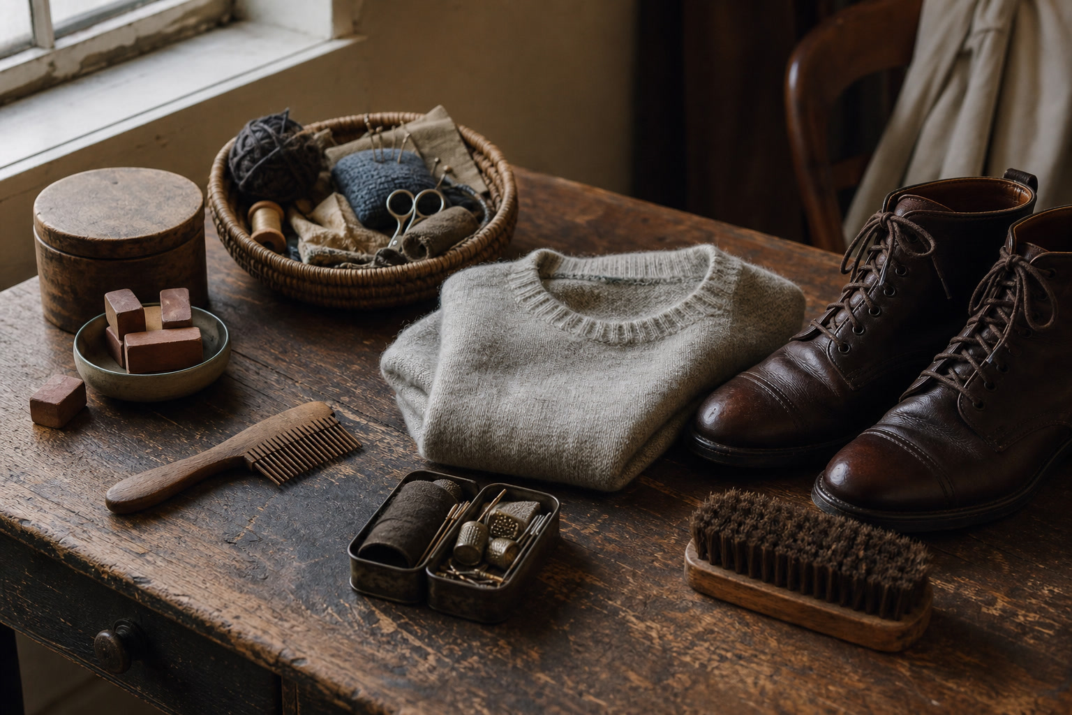
Adopting highly saturated seasonal colors introduces a significant maintenance burden that must be factored into the purchase decision. Deep blues, vibrant reds, and rich greens are notoriously unstable in the wash, prone to both bleeding onto other garments and losing their own vibrancy over time. Maintaining the original impact of the color requires strict laundering protocols: cold water washes only, the use of specialized detergents formulated specifically for darks or brights, and an absolute prohibition on tumble drying. Saturated heavy cottons, such as canvas or denim, are particularly susceptible to frosting-a localized, abrasive fading that occurs along seams, hems, and pockets after repeated mechanical agitation in a washing machine.
Storage also plays a critical, often overlooked role in the longevity of colored garments. Ultraviolet degradation is a silent, irreversible wardrobe killer. Storing a vibrant silk shirt or a pigmented wool blazer on an open rail that receives direct ambient sunlight will result in uneven bleaching across the shoulders and sleeves within a single season. To preserve the chemical integrity of the dye over multiple years, these pieces require dark closet storage, ideally protected by breathable, unbleached cotton garment bags. If a shopper is unwilling to commit to this level of preventative maintenance and careful storage, investing heavily in saturated seasonal trends will ultimately result in a degraded, unwearable garment.
Strategic Wardrobe Integration
A successful wardrobe addition operates on the principle of clean integration, not disruption. The anchor method is a vital slow-shopping metric: a new piece in a seasonal color must not require the subsequent purchase of entirely new supporting items to make an outfit viable. If a trending sage green cardigan does not instantly and without fuss pair with your existing vintage denim, your tailored navy trousers, or your standard white shirting, it will become an orphaned piece. The strict rule of three applies here. Before authorizing the purchase, the buyer must be able to mentally construct three distinct, highly wearable outfits utilizing only the items currently hanging in their closet.
Proportion and placement are the defining factors between wearing a trend and allowing the trend to wear you. Committing to a head-to-toe monochromatic look in a highly specific seasonal color is often a fast-fashion reflex that ages poorly. Slower, more deliberate buying favors proportional restraint. A vibrant shade acts best as a calculated disruptor within a muted canvas. A single, brightly colored poplin shirt layered under a heavy charcoal wool blazer, or a saturated cashmere sock breaking up the visual line between a black leather loafer and a grey trouser, demonstrates a mastery of the color without overwhelming the wearer's personal style.
Understanding the psychological half-life of a trend is crucial for long-term wardrobe planning. A highly recognizable color feels exhausting and dated when it is over-worn or applied to massive, dominant garments. By relegating the seasonal shade to secondary layers rather than primary outerwear-choosing a fine-gauge merino turtleneck instead of a sweeping wool overcoat-you significantly extend its lifespan. A secondary piece in a specific shade of lilac or chartreuse will still feel relevant and interesting three years from now, long after the trend forecasting agencies have moved on, precisely because it was never the loudest piece in the room.
The Accessory Alternative
For those who appreciate the aesthetic shift of a new season but are wary of the financial and sartorial commitment, shifting the risk to accessories is a highly effective strategy. Investing four hundred dollars in a trending sky-blue wool coat carries an immense cost-per-wear risk, particularly if the color feels obsolete by the following winter. Redirecting that exact impulse toward a high-quality leather cardholder, a pair of suede gloves, or a hand-rolled silk neckerchief in the same shade satisfies the desire for novelty with a fraction of the commitment. Accessories allow the wearer to nod to the current cultural mood without compromising the structural integrity of their core wardrobe.
Accessories also provide an avenue for experimentation with textures and finishes that might be entirely impractical or overwhelming for full garments. A patent leather handbag or a high-shine resin cuff in a seasonal bright adds a sharp, reflective focal point to an otherwise matte, subdued outfit. This textural variation makes the introduction of the color feel deeply intentional and styled, rather than a haphazard attempt to wear a trend. The contrast between a glossy, brightly colored accessory and a heavy, neutral wool or cashmere garment creates a sophisticated visual tension that sharpens the entire look.
Often, an accessory purchased to satisfy a fleeting seasonal craving proves so versatile that it transitions into a permanent, signature element of the wearer's style. A specific shade of cherry red nail polish, a deep forest green leather watch strap, or a pair of subtly tinted acetate sunglasses can become a personal trademark. These small, highly curated touches outlive the micro-trend that initially introduced them to the market, proving that when color is applied with precision and restraint, it transcends the seasonal calendar entirely.
Curating a Personal Palette Over Time
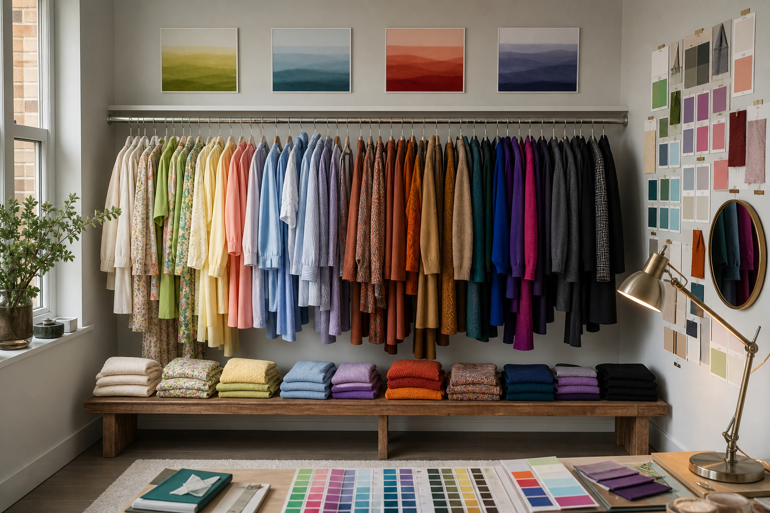
The ultimate goal of slow shopping is to shift from a reactive consumer-buying what the market dictates this month-to a proactive curator with an internal color logic. Tracking which seasonal colors you consistently gravitate toward over a multi-year period reveals your actual, enduring preferences. If you routinely ignore the pastel trends of spring but immediately purchase rich jewel tones whenever they cycle back into autumn collections, you have identified a core, unshakeable component of your personal palette. Recognizing these patterns allows you to invest heavily when your preferred colors are abundant in the market, and abstain entirely when the seasonal offerings do not serve you.
Slower consumption inherently means holding onto pieces even when they temporarily fall out of the cultural zeitgeist. A beautifully constructed garment in a specific shade of rust or mustard will inevitably cycle out of favor, only to return a few years later. Proper archiving is essential. Utilizing acid-free tissue paper for delicate silks and breathable canvas storage boxes for heavy knits ensures that these garments remain pristine during their dormant periods. When the cyclical nature of fashion inevitably brings that color back into the spotlight, you are already equipped with high-quality, perfectly preserved iterations of the trend.
When seasonal colors are selected based on strict criteria of material quality, biological skin compatibility, and existing wardrobe synergy, they cease to function as trends. They become permanent fixtures. Over a decade of careful acquisition, this process results in a rich, highly individualized closet. The wardrobe operates entirely independent of the current fashion calendar, built on a foundation of deeply personal color choices that reflect the wearer's actual life, rather than the fleeting whims of the industry.
Pre-purchase checklist
- Verify the material composition: ensure the fabric is capable of holding the dye richly without looking flat or artificial (favor natural fibers over cheap synthetics).
- Apply the rule of three: confirm you can immediately build three distinct outfits with the new color using only items you already own.
- Conduct the face proximity test: hold the garment near your jawline in natural, indirect daylight to ensure it does not cast sallow shadows on your skin.
- Assess the maintenance reality: check the care label to confirm you are willing to execute the cold-water washing or dry-cleaning required to prevent fading.
- Evaluate your storage capabilities: ensure you have dark, UV-protected closet space to prevent the saturated dye from sun-bleaching over time.
Who should skip this
Consumers who feel an underlying pressure to adopt a color simply because it dominates current editorial spreads and store windows should entirely bypass this purchase. If your existing wardrobe is strictly composed of architectural neutrals-blacks, whites, and greys-and the introduction of a trending 'brat green' or 'butter yellow' causes immediate styling anxiety, do not force the integration. Furthermore, if wearing the seasonal shade requires purchasing new foundation or blush to make your complexion look healthy, the garment is working against your biology. Stick to updating your wardrobe through structural changes, such as new tailoring silhouettes or upgraded material textures, rather than participating in a color trend that will likely be relegated to the back of the closet within six months.
Affiliate transparency
FikaLooks sustains its independent editorial research and slow-shopping journalism through carefully vetted affiliate partnerships. When you purchase through links in our features, we may earn a commission. However, our selections are dictated entirely by material integrity, dye stability, and long-term wardrobe viability, never by retail commission rates. We prioritize garments that survive beyond the seasonal hype.
FAQ
How can I wear a trending color that completely washes out my complexion?
Distance is the most effective tool. Move the color away from your face by wearing it as trousers, a skirt, or a shoe. If you must wear it on your upper body, introduce a stark visual barrier-such as a crisp white collared shirt or a neutral silk scarf-between the garment's neckline and your jawline to prevent the color from reflecting onto your skin.
Will a highly specific seasonal color look immediately dated next year?
The longevity of a color is heavily dependent on the silhouette of the garment. A seasonal color applied to a hyper-trendy, exaggerated cut will age terribly. However, that exact same color applied to a classic, perfectly tailored piece-like a standard merino crewneck or a straight-leg trouser-will survive the trend cycle and read as a deliberate personal style choice rather than a dated fad.
What is the best way to prevent bright seasonal colors from bleeding or fading in the wash?
Prevention requires strict laundering discipline. Always turn the garment inside out to reduce mechanical friction on the dyed surface. Wash exclusively in cold water on a delicate cycle, use a detergent specifically formulated to suspend dyes in the water, and include a color-catcher sheet. Never expose saturated colors to the extreme heat of a tumble dryer; lay them flat to dry away from direct sunlight.
What should I do if the color looks entirely different in person than it did on the retailer's website?
This is a frequent occurrence due to monitor calibration and aggressive studio lighting. Do not try to convince yourself to like a color that disappoints you in person. Before removing any tags, view the garment in natural daylight. If it leans too sallow, too bright, or too muddy compared to your expectation, utilize the return policy immediately. Never keep a compromised color.